Over the last few years as a juror on the Peabody Awards, I have seen a lot of innovative uses of scroll-based storytelling. As just one example of many, the New York Times’ Maui Wildfire Timeline takes you through the history of what happened minute by minute during the destruction of Lahaina in 2023. It shows how, when done right, these kinds of map-based scrolling animations are a very powerful way to help people understand how stories play out in physical space.
Stories like this are showing up at other news organizations, but not many. Why not? The truth is two-fold.
First and most importantly, most journalism organizations don’t have software developers to work with the way well-funded places like the Times does. And second, their content management systems often don’t support features like this out the of the gate.
For this reason, for the last year or so I have been using AI Vibe Coding tools to build various systems that let people tell interactive stories with maps. I worked on this at the same time I was building out WebXRIDE, an immersive A-Frame-based storytelling tool connected to a grant I was a part of at Syracuse University.
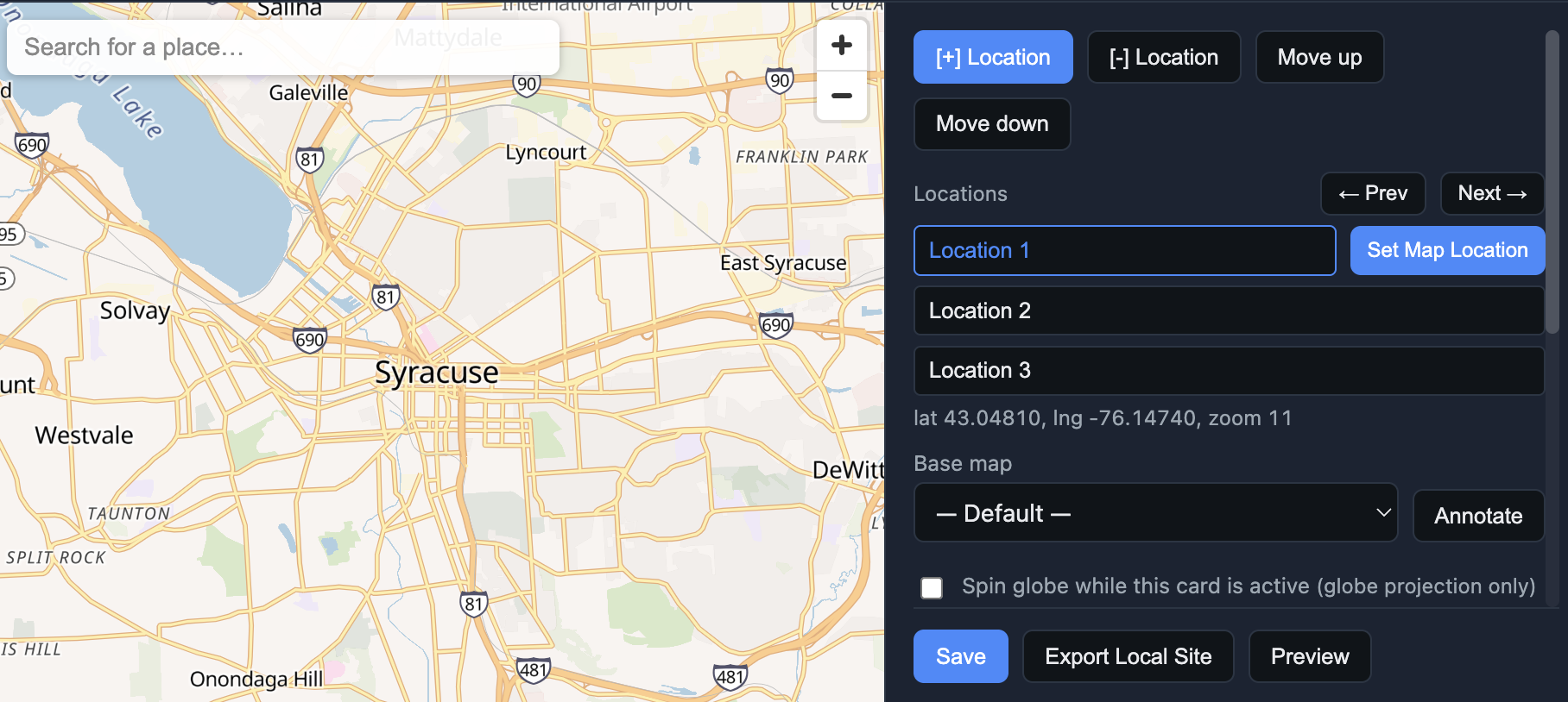
I just soft-launched and open sourced the first of these geographic storytelling tools. It’s called Maps & Cards, and you can use it in Guest Mode right now. It Is also available on Github under an MIT open source license for anyone who wants to modify it for their own use.
Here’s a short video of how it works.
As you can see, it’s very basic — though there are a few more features that don’t show up in that video. Other things you can do include:
- Add placemarkers
- Add labels
- Switch between globe and flat map mode
- Set the globe to spinning mode for any card. See an example of that in the default story about the earth.
I will be adding more features to this and eventually will also make these tools available in WebXRIDE. But for now, I think it’s fun to experiment with it as its own unique tool because of how universal these map-scrolling stories are. Every place has stories that need to be told, and they can often best be told on maps.
One reason I made it available as open source is because I will be including this in my NAHJ 2026 presentation about Using AI to Create Interactive News Apps. I will show my tool, show everyone the Github repository, and then have those with laptops download the code and modify it using Cursor or whatever AI vibe coding tool they prefer. I think this kind of sharing, remixing and inspiring is what needs to come back to digital journalism, and open source combined with AI is the way to make that happen.
In the past, the only way to do this kind of thing would be to go out and hire a developer or two or an expensive developer firm. There are still good reasons to do that, but for something like this, you can do it all on your own on a weekend for $20/month. These are exciting times to be working in digital journalism!
ADDED 7/23: For my NAHJ Conference session, participants will be using Cursor on a free trial to modify and adapt this repository for their own use. You can do the same using this guide that I created for that session. Have fun!